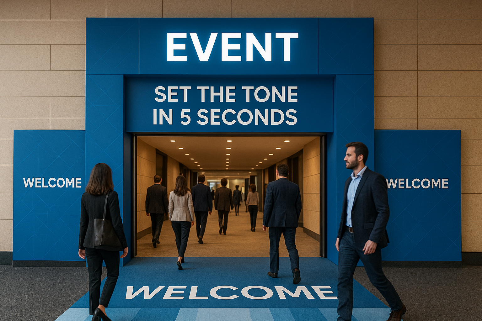
Your event entrance is more than a photo spot. It’s the first contact point between your audience and your brand. In the first 5 seconds, people decide if your event feels professional, inspiring, or forgettable.
Here’s how to use arches, portals and floor graphics to create an entrance that sets the tone — and guides people inside.
1. Define the emotion you want to create
Before thinking about materials, ask:
How do we want people to feel when they arrive?
Some emotional directions:
-
Innovative and futuristic
-
Warm and welcoming
-
Premium and exclusive
-
Fun and playful
This will guide colors, lighting, shapes and even the type of graphics you choose.
2. Use arches and portals as a “frame” for your brand
Entrance arches and portals are perfect for:
-
Logos and event titles
-
Taglines and key messages
-
Sponsors or partner brands
Best practices:
-
Keep the main message short and legible from a distance
-
Place logos at eye level or slightly above
-
Use lighting (LED strips, spotlights, lightboxes) to highlight the structure
Think of it as a physical cover page for your event.
3. Turn the floor into a guide with floor graphics
Floor graphics are not just decorative. They can:
-
Guide the flow of people toward registration or key areas
-
Mark safe paths and high-traffic zones
-
Highlight zones: “Expo Area”, “Main Stage”, “Photo Op”, etc.
Combine:
-
Arrows
-
Icons
-
Short labels
This makes orientation intuitive, especially in large venues like convention centers and malls.
4. Create a photo-op moment (on purpose)
If you know people will take photos and selfies at the entrance, design it that way:
-
Choose a clear background area where people can stand
-
Place logos and event hashtags in strategic spots
-
Add lighting that flatters people’s faces (not just the structure)
Every photo shared becomes organic promotion for your event.
5. Keep branding consistent across entrance, booth and signage
Entrance branding should not feel disconnected from the rest of the event.
Make sure to repeat:
-
Colors and graphic style
-
Typography
-
Iconography and visual motifs
When the entrance, booths, signage and stage design feel like one family, your event looks more professional and easier to recognize.
6. Think safety and durability from the start
In high-traffic environments:
-
Use non-slip materials for floor graphics
-
Make sure structures are properly anchored
-
Confirm measurements and clearances with the venue
A good production team will design with safety, not only aesthetics, in mind.